WunderGraph's Brand Refresh



Engineering leads land on your site before they land in your product.
Before picking a lane, I explored three.
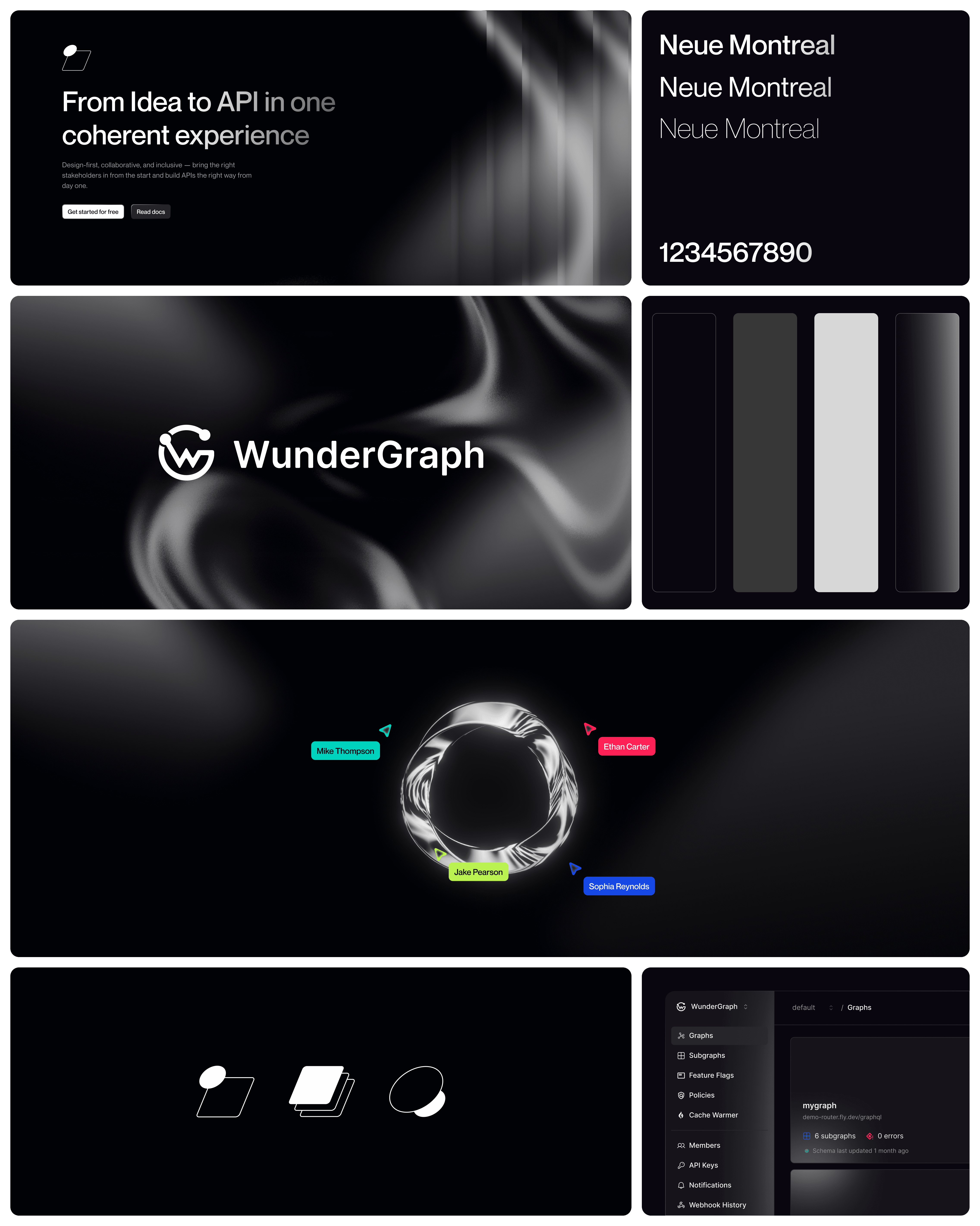
Rather than presenting one polished direction and hoping it landed, I designed three full visual identities, each answering the same question differently: how much should WunderGraph stand out versus fit in?
A pure black and grayscale palette with Neue Montreal as the typeface. No colour competing for attention, just fluid silk-like textures and clean geometry. This direction let the product and the copy do all the talking. It felt closest to something like Vercel or Linear, confident enough not to need colour to prove a point.

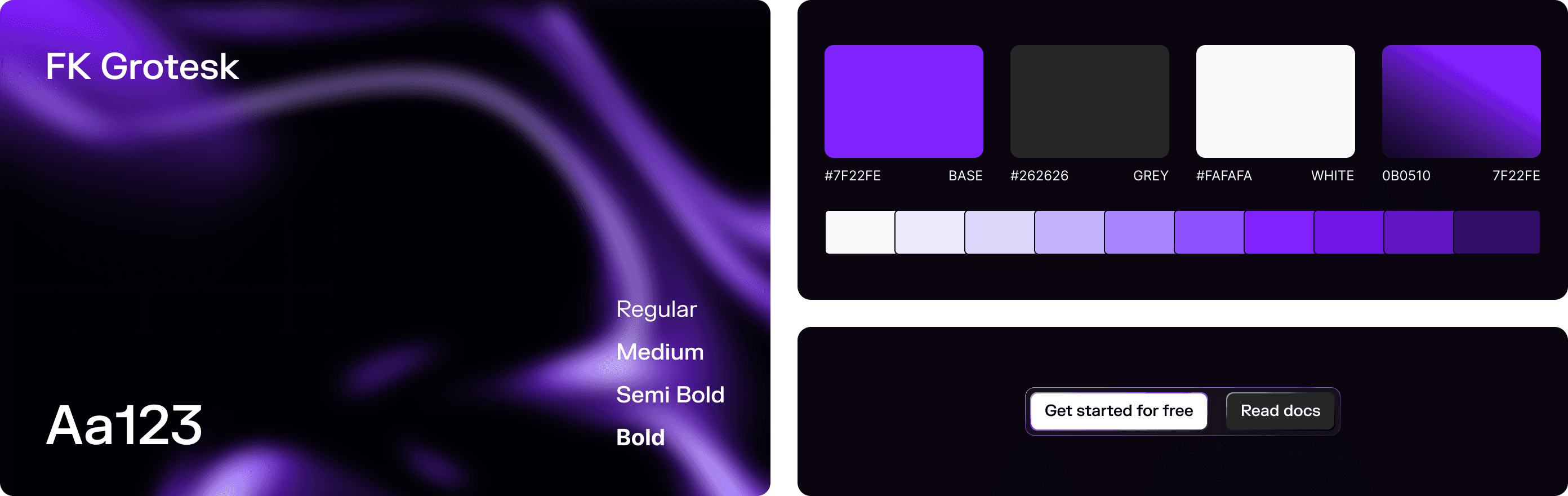
WunderGraph is a technical product, but it's also an ambitious one, trying to carve out a distinct identity in a sea of dark-mode developer tool sites that all start to blur together. Blue would have been the safe choice, but safe wasn't the goal. Purple gave WunderGraph a visual identity that actually stands out in a crowded market.
Blue would have blended in with every other infrastructure tool out there. Monochrome would have played it too safe. Purple was the direction that gave WunderGraph a personality worth remembering, while still reading as sophisticated enough to hold its own in front of an enterprise buyer.
Colour and typeface didn't have to come from the same direction, though. We kept Inter from the blue exploration instead of carrying over FK Grotesk. FK Grotesk had more character, but a developer tool lives or dies by its docs, tables and dense technical copy, and that's exactly where character starts working against legibility. Purple was already doing the job of making WunderGraph memorable, so the type didn't need to fight for attention too.


From token to full page.
Once the direction was locked, I built out the full system, colour tokens, type scale, spacing and the fluid background textures that show up across the site. Inter held up well across everything from dense docs pages to dashboard labels, which mattered more here than having a typeface with extra personality.

Live cursors as a design element
WunderHub lets teams build APIs together in real time, which was one of the USPs. Showing live cursors on the site immediately tells people that, no explaining needed.

Used subtle glows, gradients and flowing background textures. It gives the site the energy and movement we wanted, keeping it from feeling like a flat, static dev tool page.
The thin line patterns running through the background add another layer of detail. They keep things feeling structured and precise, which fits a product that's fundamentally about connecting and organising data.

Elevation works backwards
In light mode, shadows do the job of showing what's on top of what. In dark mode, shadows barely register, so elevation had to come from lighter surfaces sitting on top of darker ones instead. Every card, panel and modal needed its own step up in brightness rather than a shadow to feel like it was floating above the page.
The base couldn't be pure black
Pure black looks striking in a mockup but gets tiring fast in real use, especially against bright glows and gradients. The base sat a shade above true black instead, which gave the interface room to show depth and kept long stretches of dense technical copy easier to read.
Interactive states had to work harder
A subtle hover state that reads fine on a white background almost disappears on a dark one. Every button, link and input needed a more visible shift on interaction, a clearer border, a stronger colour change, since the quiet cues that work in light mode just don't carry the same weight here.

Hover here
Hover here
Copied
Tooltip
An interactive prototype for stakeholders. (thanks to framer :))
Static mockups can only tell you so much, especially with a direction built around movement. Once purple was locked in, I built a full interactive prototype in Framer, real page transitions, the fluid background motion, hover states, so stakeholders weren't looking at flat screens and imagining the rest.
This mattered more than usual here. A lot of what made purple work, the glow, the movement, the live cursor animation, only actually reads once it's moving. Presenting a static comp of the hero and asking four co-founders to imagine the motion would have left too much room for four different interpretations. The prototype closed that gap before a single line of code was written.
Presenting three directions instead of one was the right call. It gave the team something real to react to instead of just approving or rejecting a single idea.
We had 4 co-founders plus a handful of stakeholders, and getting everyone to the same page was hard at the start. Everyone had a slightly different read on where the brand should go. What actually helped was over-communicating. Sharing progress daily in a shared Slack channel instead of siloed DMs kept every decision visible to the whole group as it happened.
It meant fewer stakeholders showing up later wanting to change something that had already been agreed on, since everyone had seen it evolve in real time instead of being handed a finished decision.
We also tested the 3 options with customers, so it was helpful to validate a change this size with real users before committing. It made the final call feel even more solid.
Show options, not a verdict. One polished direction just gets a yes or no. Three real ones actually get people talking, and that's where the alignment happens.
Keep people in the loop as you go. You don't need everyone to agree at every step. You just need them to see the decision taking shape instead of getting handed a finished one at the end.
A decision isn't final until it's tested. A bunch of stakeholders liking something isn't the same as customers liking it. Testing is what actually confirmed we'd made the right call.